Selected product work
Shipped interfaces, systems and case studies.
The colour, type and paper thinking behind dense B2B workflows, multi-brand token sets and accessible onboarding flows. Client names are left out where the NDA asks for it.
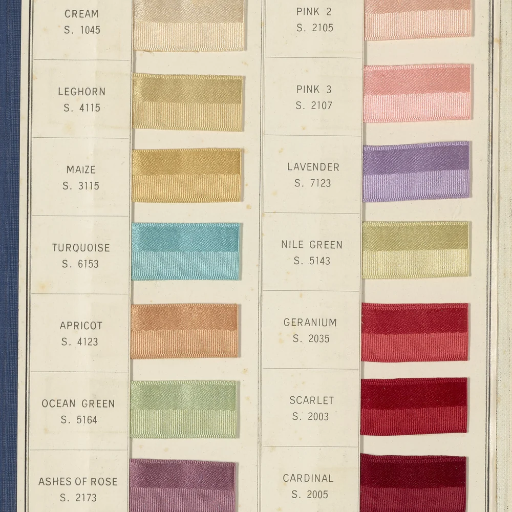
Numbered colour swatches on a reference card: primitive scales laid out before they are mapped to surface, border and state tokens.
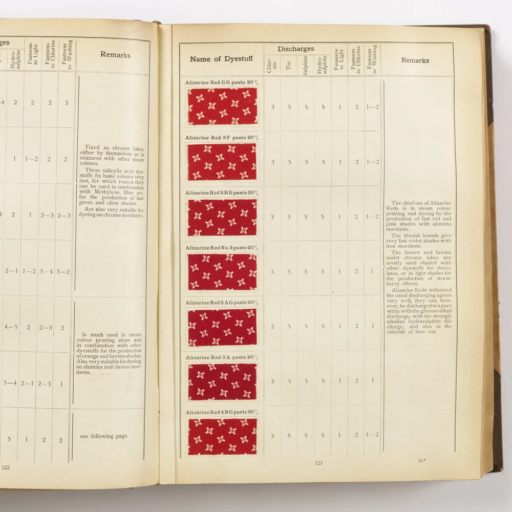
An open sample book of printed swatches, each hue shown in several strengths, as a light- and dark-mode palette needs.
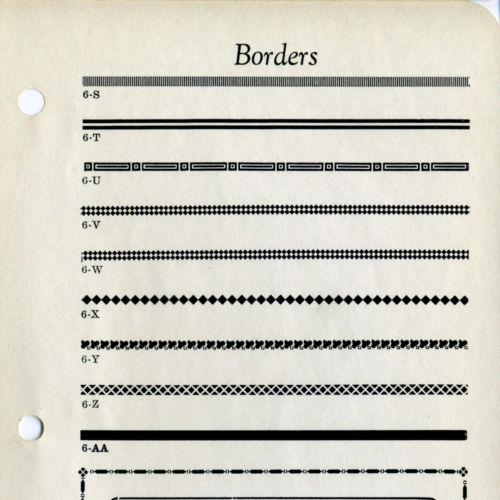
A letterpress specimen of printed border rules, the same care that goes into every annotated border, divider and state in a handoff sheet.

A white paper study model lit from behind: low-fidelity form, tested before a single frame is drawn in Figma.
Swatches set side by side on one card, the way colour pairs are compared against WCAG 2.2 AA contrast before they become tokens.
Printed dye swatches across an open reference book: one family of reds in many strengths, much like a multi-brand token set.
Border rules printed on a specimen page, a reminder that spacing and rhythm are designed rather than left to defaults.
A card study model under warm light: the hands-on thinking that comes before journey maps and service blueprints.